


❧ Scroll to, next project
PsychoDietMed
Feel the atmosphere of relaxation on the website for the brand creating a home massage course 💆🏻♀️
Challenge
How to combine building long-term brand awareness among consumers with quick market validation? And at the same time generate initial revenue for business development? 👀
Solution
We have created a cohesive image, strategy, and website. The whole combines aesthetics with functionality, aiding in a quick business launch and long-term brand awareness building.
Sector
Personal brand
Client
Homemade Massage
Year
2024
Services

Daily rush, stress, and pressure. Sounds familiar?
Many of us dream of a moment of relaxation in a massage parlor, but then HE appears – lack of time.
The Home Massage brand, created by Edyta, opens the door to relaxation in the comfort of your home. All thanks to the massage course in "home conditions", which everyone can learn!


Edyta had years of experience behind her, but in this business, she wanted to start with a clean slate. Without a marketing background and recognition, but with a grand vision.
How to combine a quick start with a long-term strategy for building brand awareness?
How to attract the attention of the first customers and quickly validate the idea?
These questions became the beginning of our collaboration…

This project required building everything from scratch: from visual identification, through the website, to advertising campaigns on Google and Meta.
The communication focused on showing that massage is not a luxury for the few, but something accessible to everyone.
Our goal in creating the campaign was not only to promote the course, but also to build a narrative and evoke emotions associated with closeness, relaxation, and spending time together.

Brand customers are people who lead an active lifestyle and don't have time for professional appointments. They value convenience and time-saving.
Among them, we find busy individuals seeking relaxation after work, young parents for whom going out is a logistical challenge or people who want to give their loved ones a special gift.

The brand's logo exudes calmness and harmony, which perfectly correspond with the relaxing nature of its offerings.
The central element is a minimalist symbol of hands encircling a drop – it's a subtle nod to care and concern for well-being.
The modern and slightly rounded font in the logo emphasizes professionalism, adding a friendly character.
In the matter of colors, we have chosen a sea shade of green, symbolizing calm, nature, and trust.
It intertwines with pastel mint, which introduces freshness, lightness, and a relaxing atmosphere!

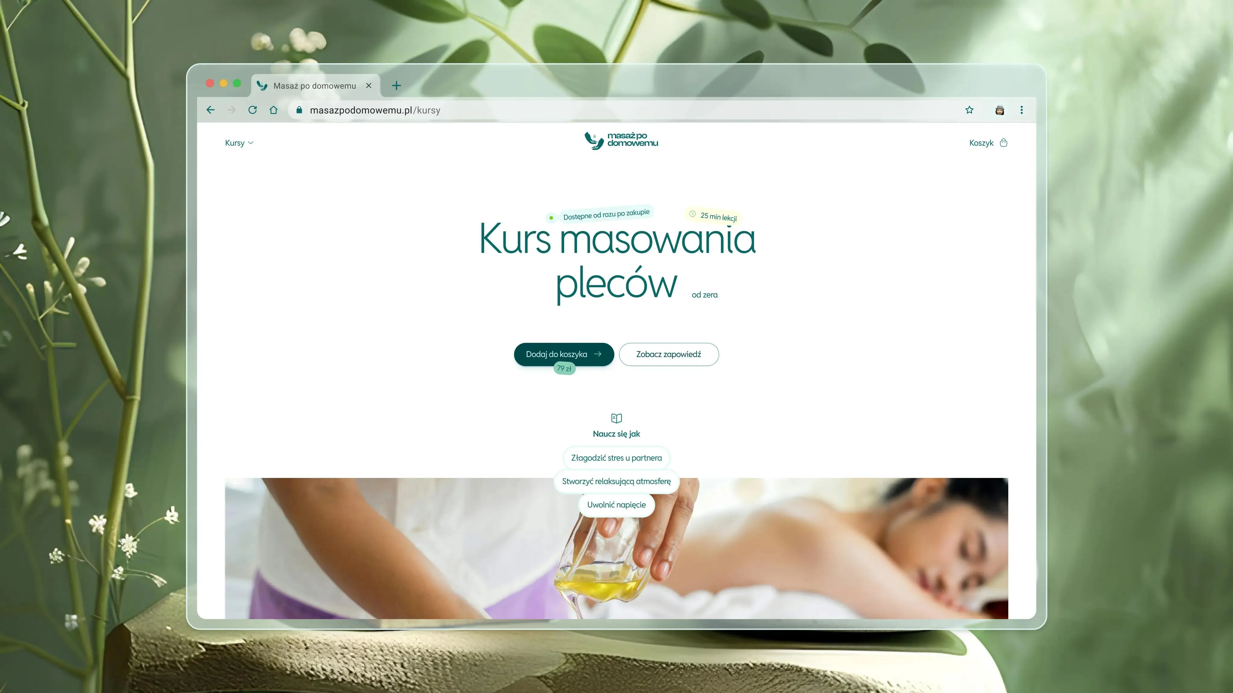
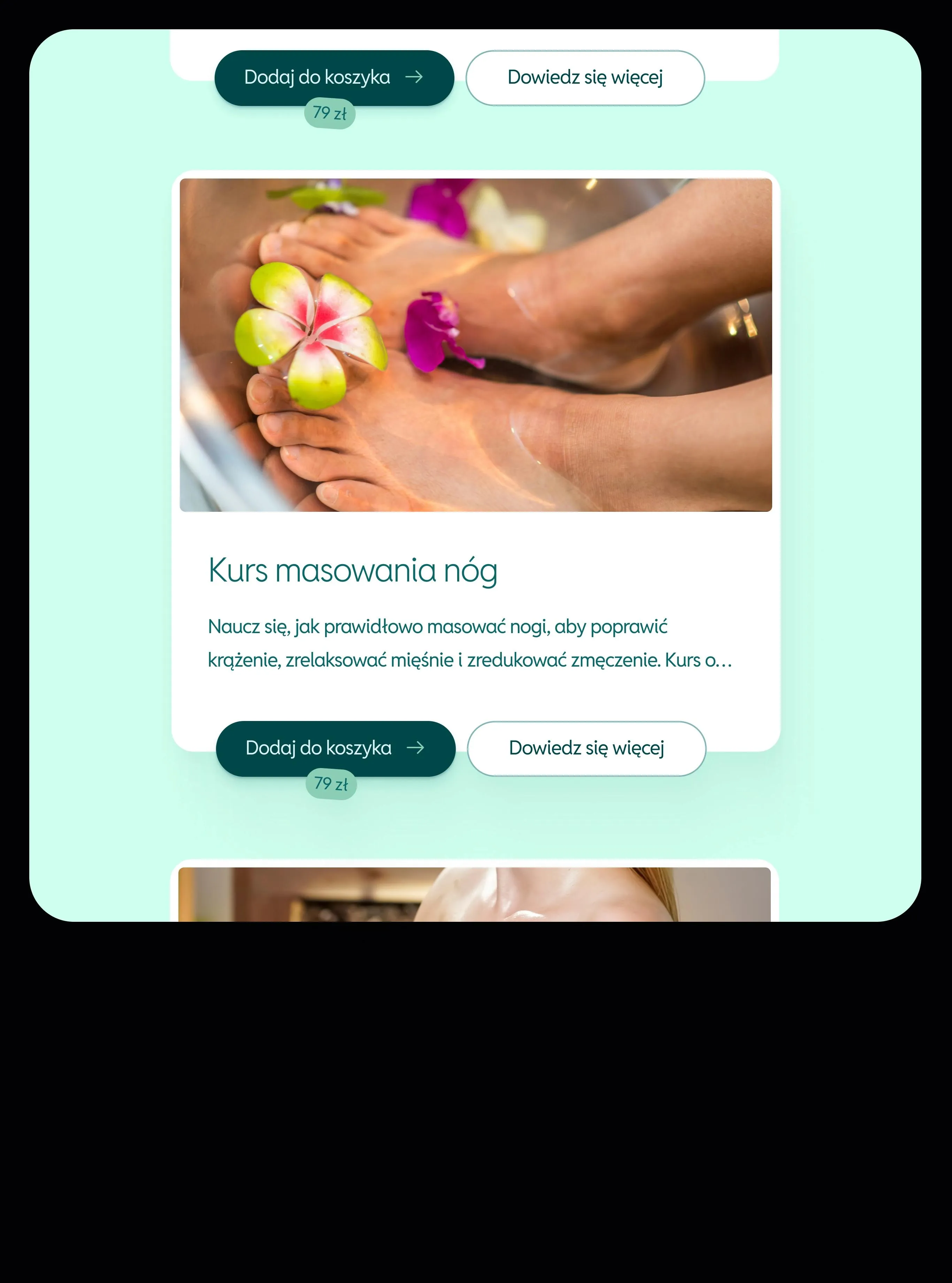
The website we created is the perfect blend of aesthetics and functionality. We've thought through every detail to ensure that users feel relaxed while browsing the site, and that nothing disrupts their equilibrium during the course purchase!
👉🏻 A clear structure allows for quick finding of the necessary information.
👉🏻 Photos immerse you in the atmosphere of home massage and build trust in the brand.
👉🏻 A subdued color palette is calming, making the website a pleasant place to explore!
The entire presentation makes it easier for users to understand the offer and allows them to decide on purchasing an online course 🛍️
PsychoDietMed