

❧ Scroll to, next project
Kierunek Dzierganie
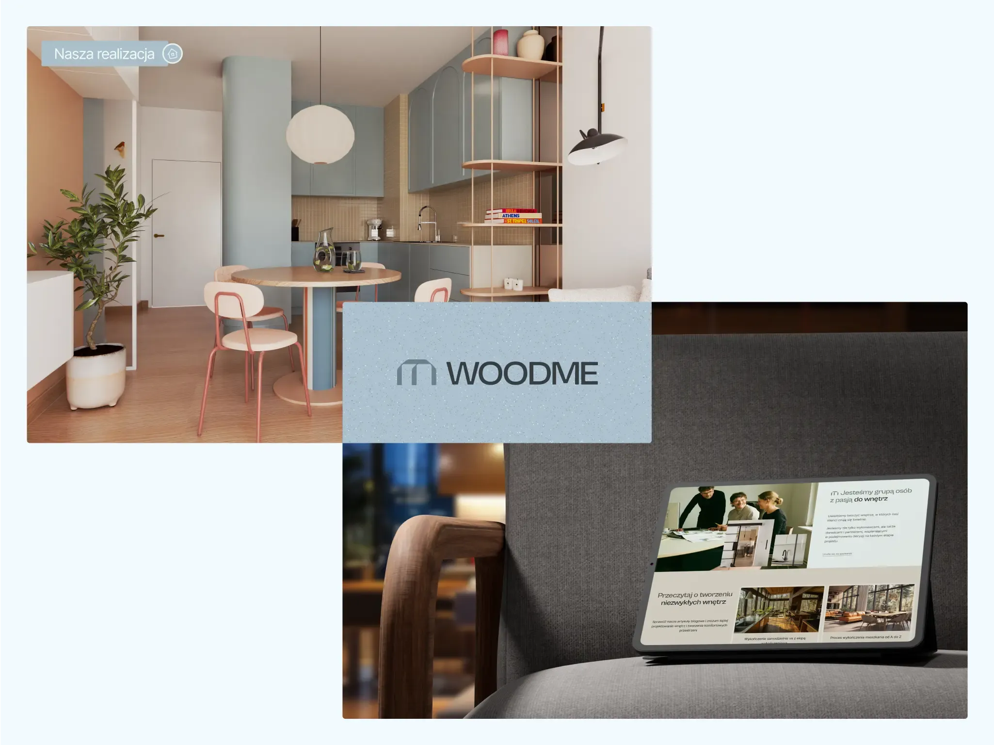
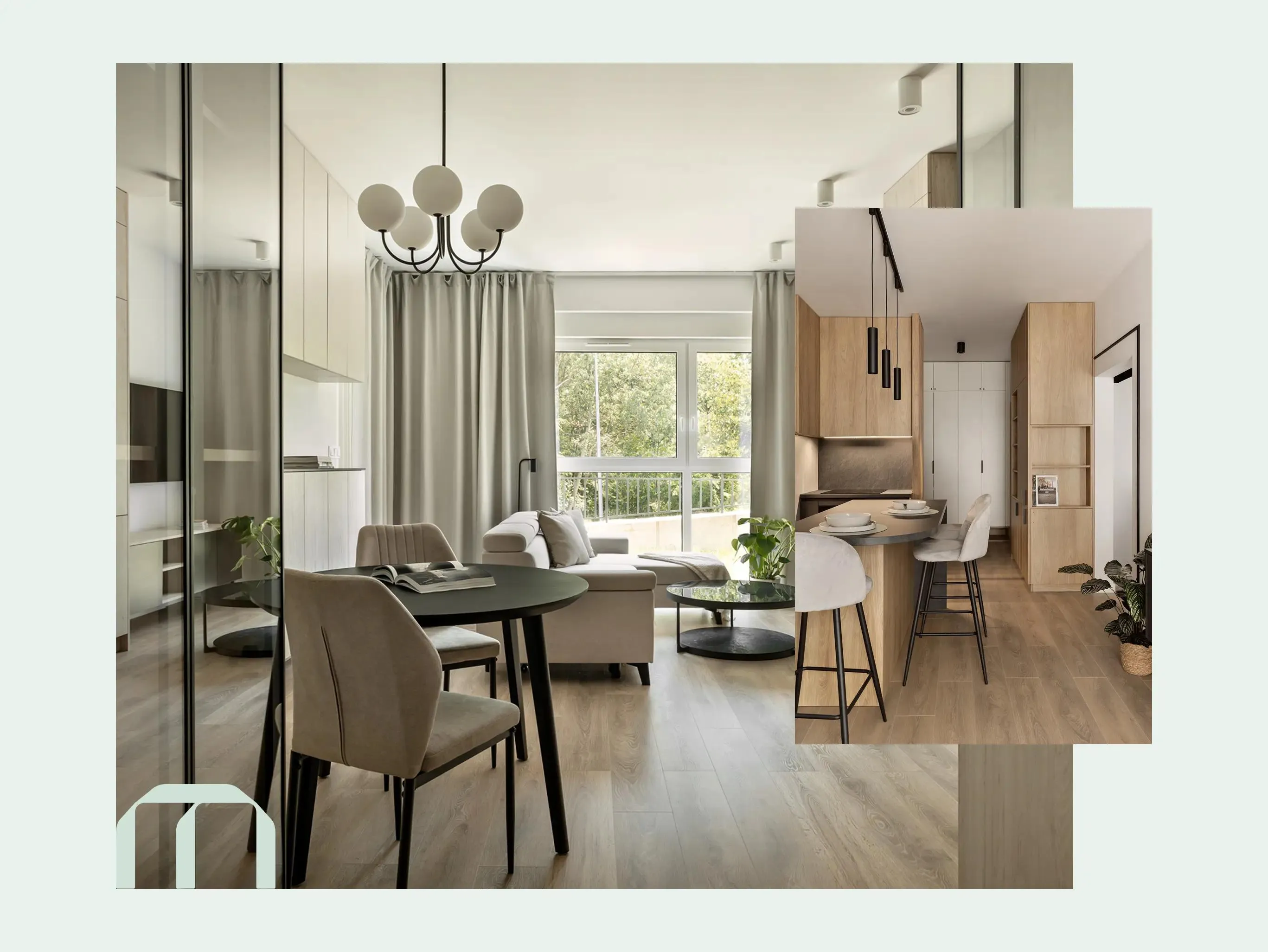
Interiors with soul? That’s a must at WOODME! We designed a website for a brand that creates unique spaces and custom-made furniture 🛋️
Sector
Interior design, furniture manufacturing
Year
2025
Services
Wood, design, quality – these three words perfectly capture WOODME’s philosophy.
This brand was founded by Żaneta and Piotr, passionate creators who believe that well-designed, thoughtfully planned interiors enhance everyday comfort!
They offer custom-made furniture and interior design services for both private clients and businesses 💼
WOODME has been growing rapidly 💪🏻
At Kryptonum, we made sure that its new brand image kept up with its evolution.
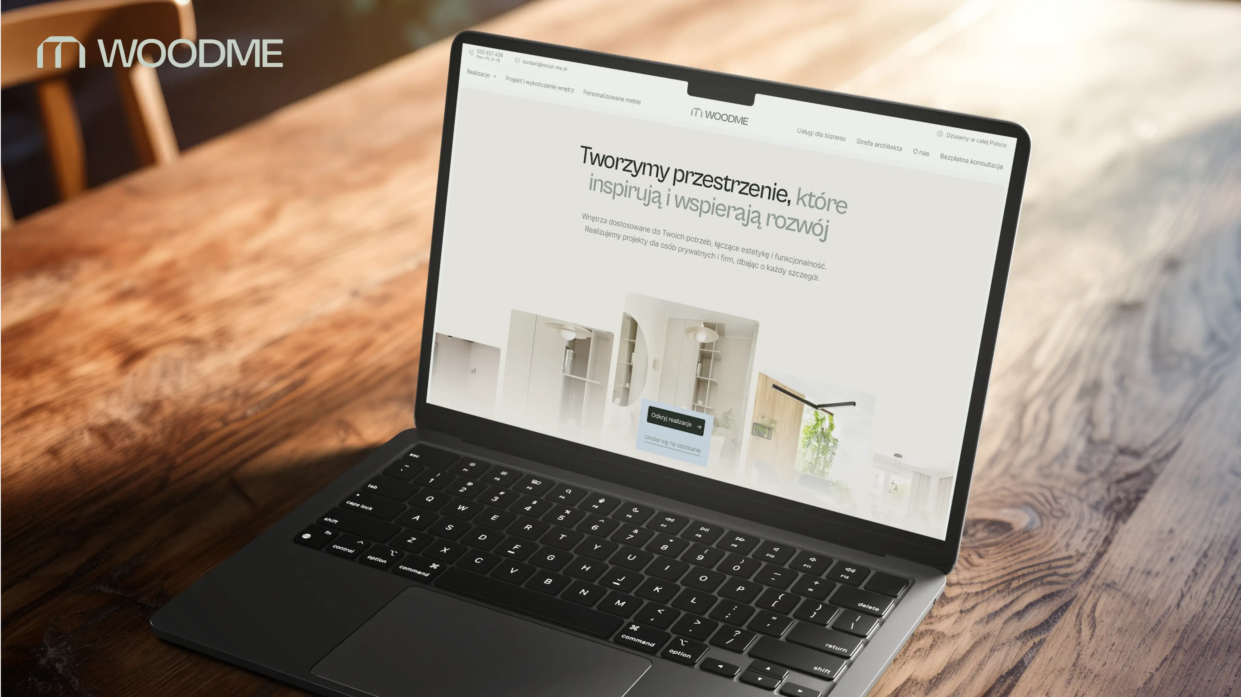
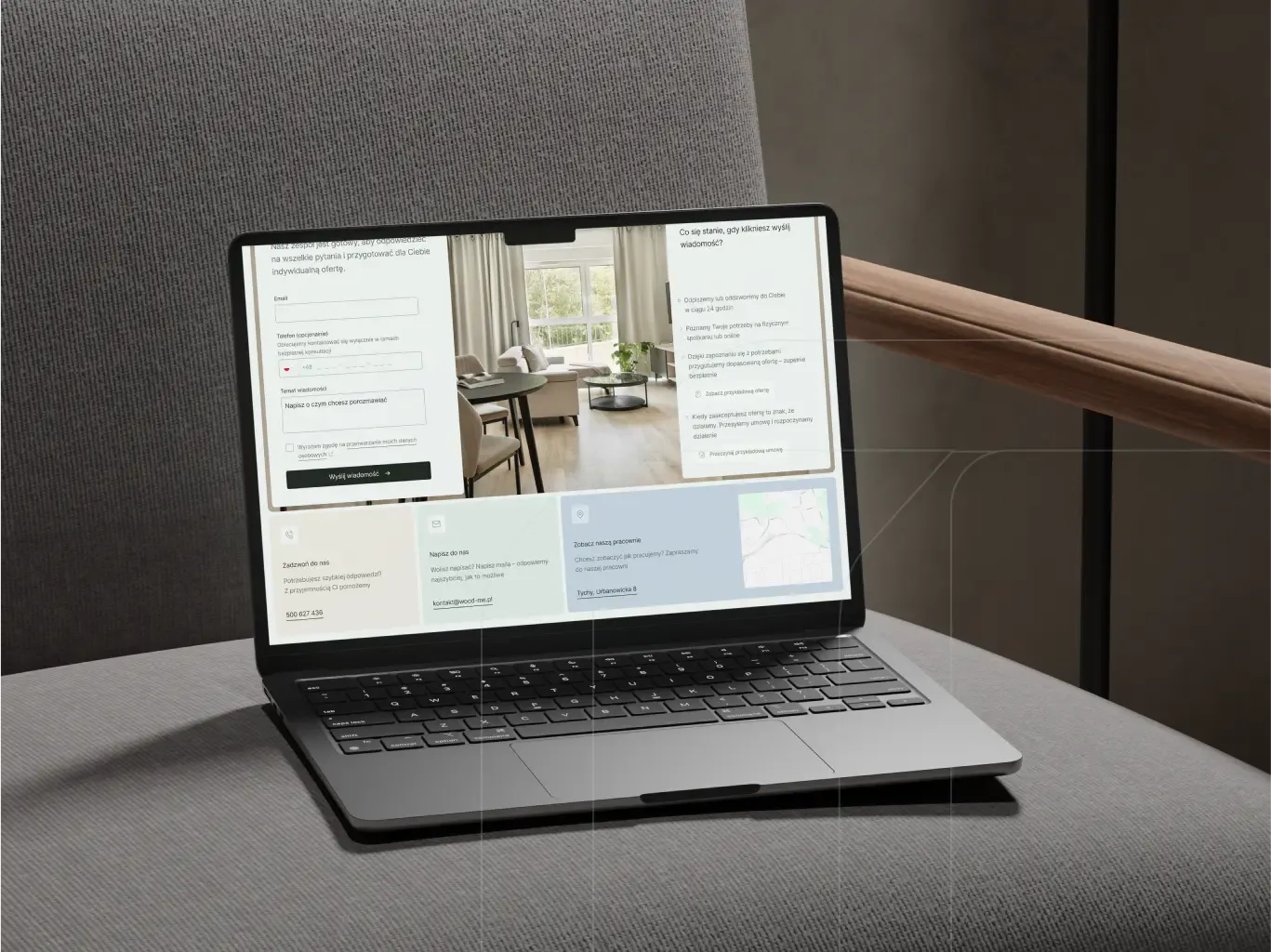
We started with strategic workshops to gather valuable insights about the business, which helped us craft a compelling visual identity. From there, we moved on to designing a modern and engaging website!
Who are WOODME’s services for?
▫️ Private clients – looking for unique and functional solutions for their homes.
▫️ Business owners – including beauty salons, dental clinics, and more.
▫️ Individuals and companies who prioritize quality and originality over mass production.
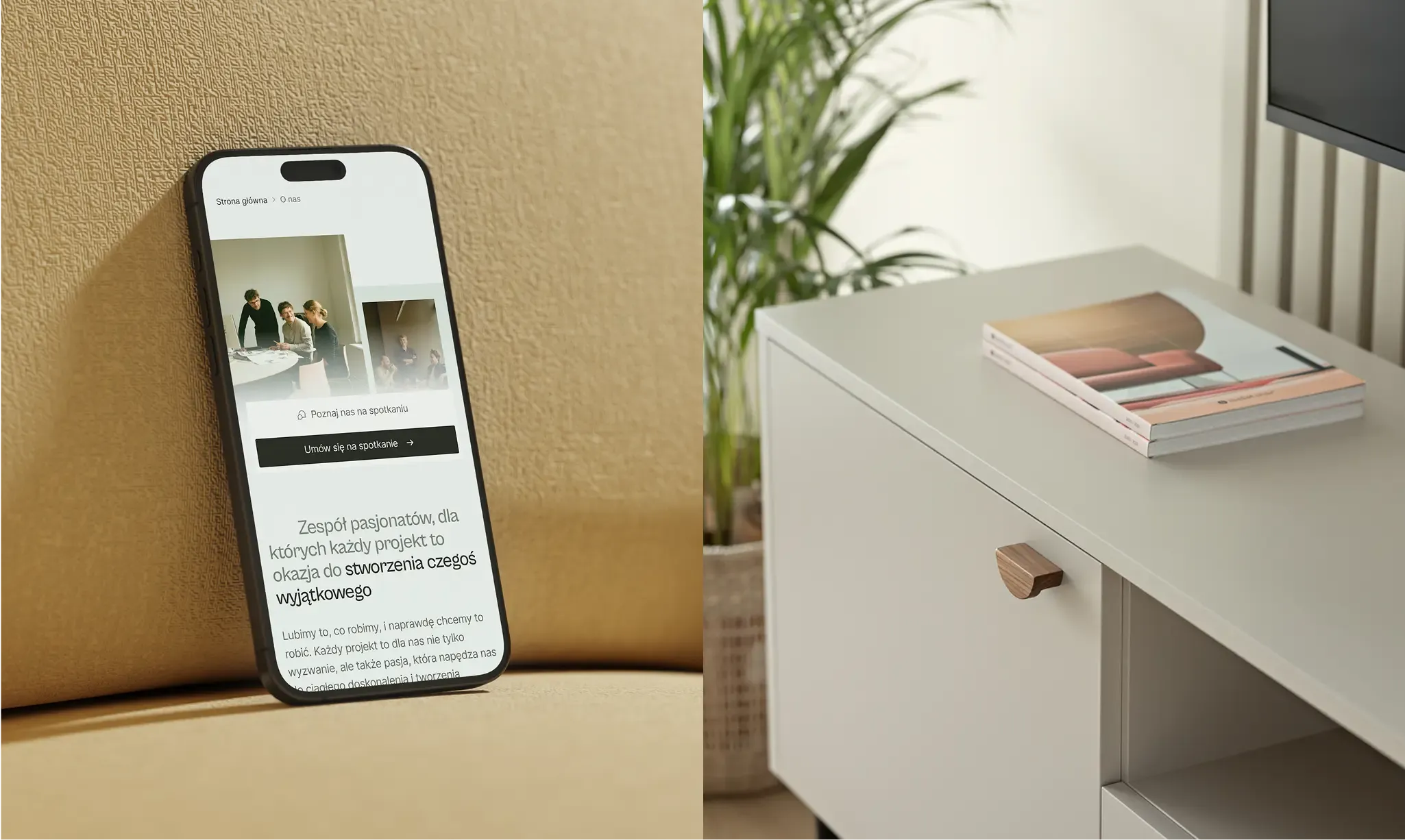
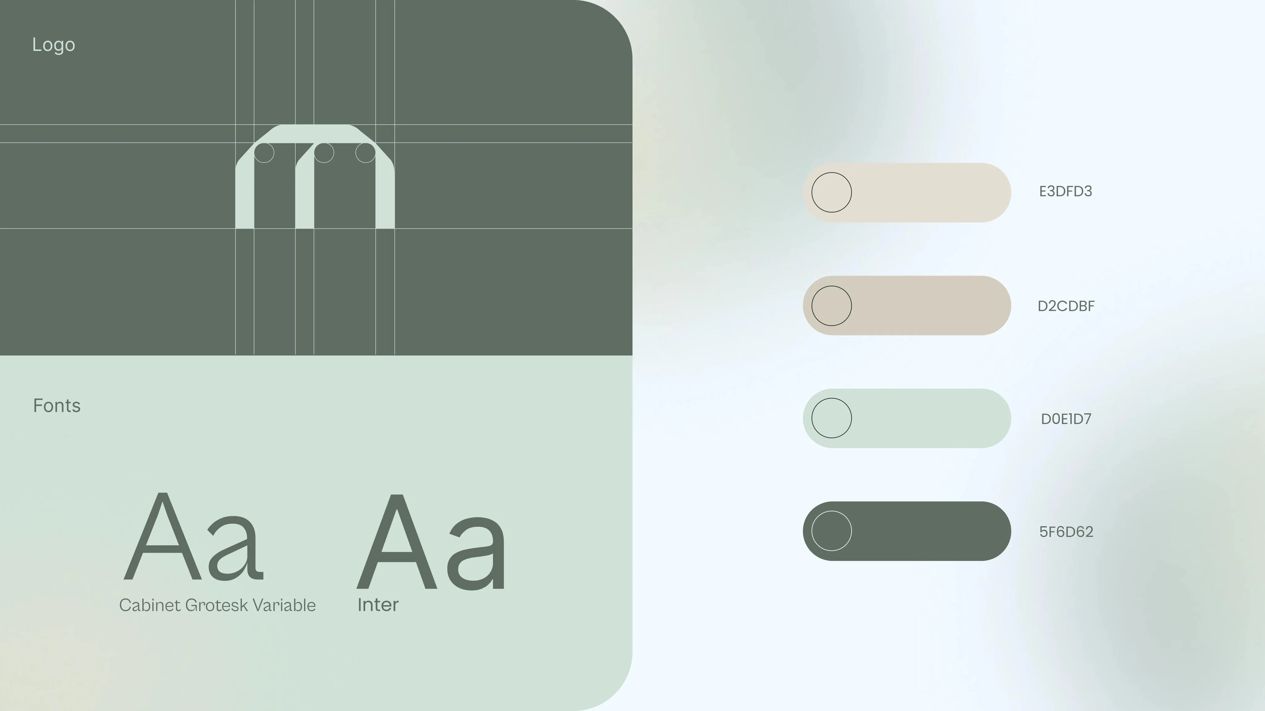
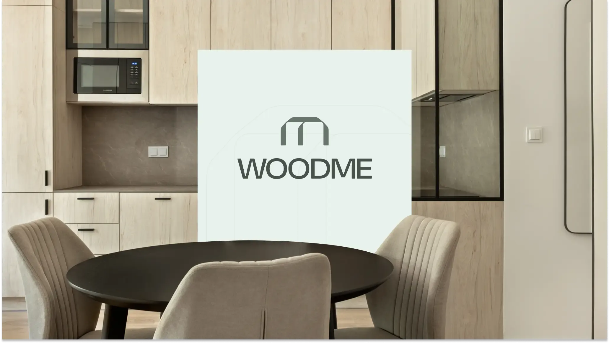
What does WOODME’s new brand identity look like?
The logo we designed blends simplicity with elegance. Its subtle shape reflects the essence of wood, furniture, and architecture. At the same time, it exudes modernity, symbolizing growth and staying ahead of the curve.
That delicate arch resembling an entrance? It’s a symbol of openness toward clients and an invitation to collaborate 🤝🏻
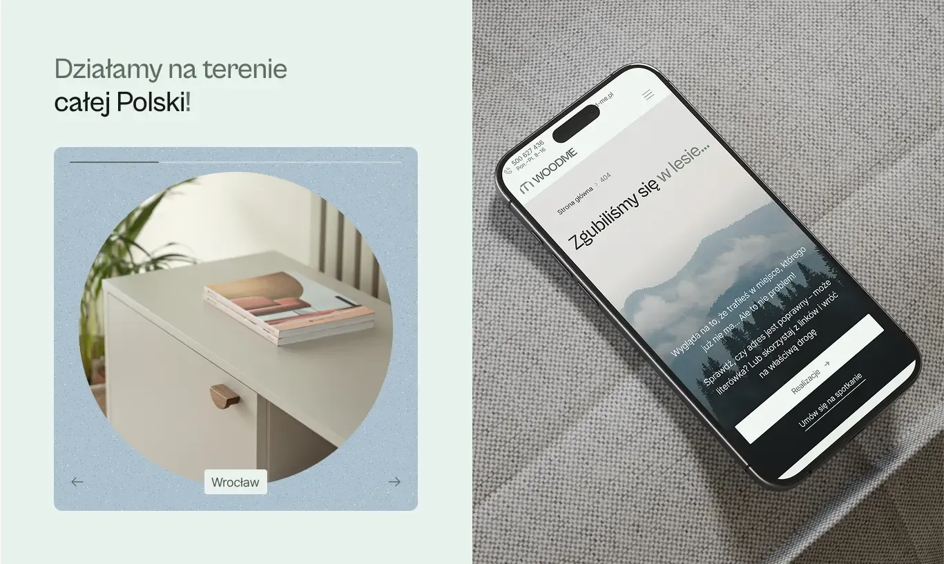
The color palette featured on the website and throughout the brand’s visual identity perfectly embodies its values!
🌿 Shades of green – symbolizing harmony, sustainability, and durability.
🌰 Beige and warm wood tones – reflecting the essence of natural materials.
🔹 Soft blue accents – evoking trust and a modern approach.
The entire aesthetic is complemented by clean, sans-serif fonts that enhance readability and maintain a light, elegant feel.
The result?
A harmonious and sophisticated visual identity that captures attention—without overwhelming the viewer 🤩
Żaneta and Piotr don’t just create interiors—they build relationships and pay attention to every detail.
Thanks to our collaboration, WOODME now has a cohesive brand identity and a website that attracts clients while reinforcing a professional image!
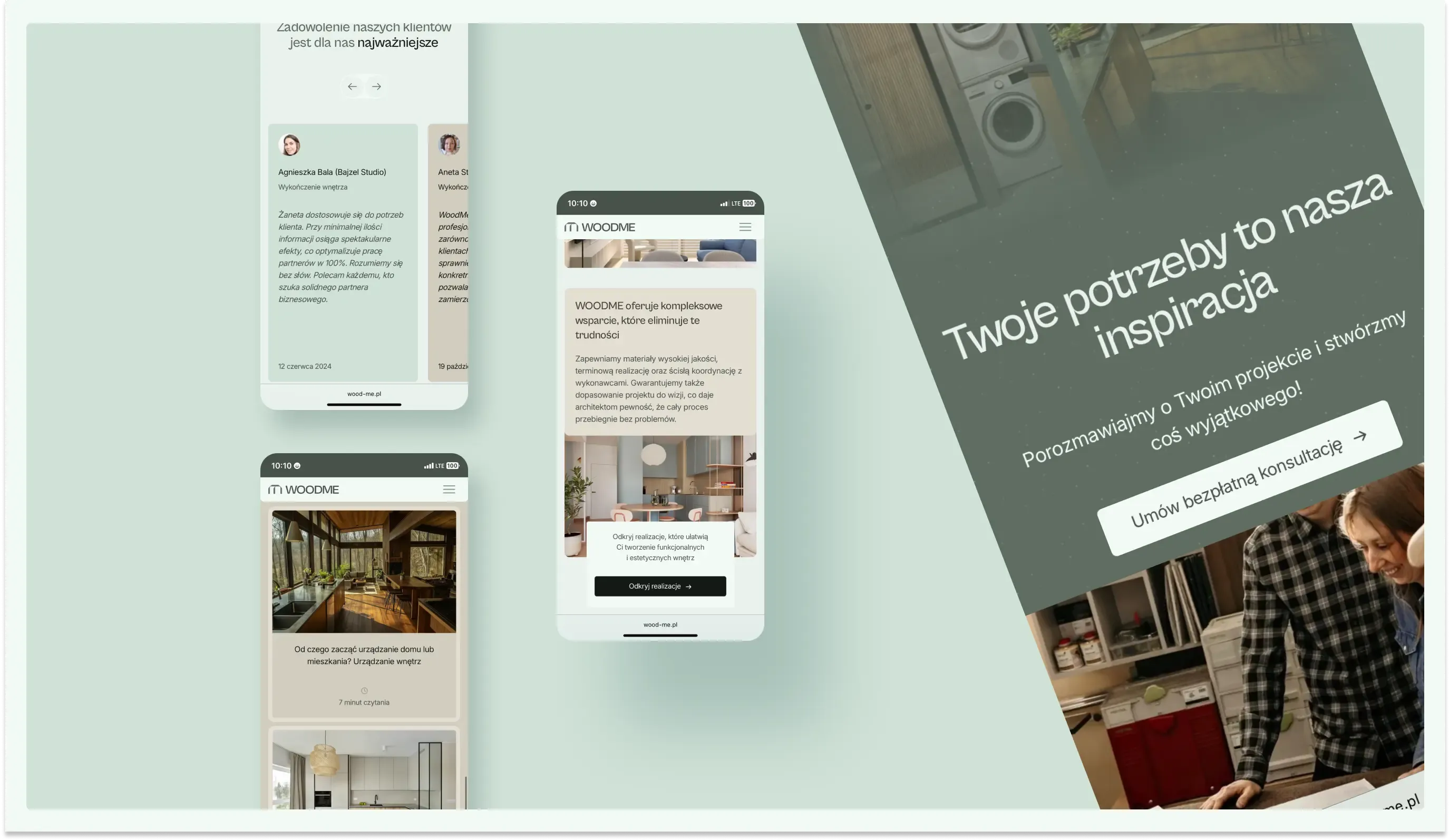
The website’s minimalist and intuitive layout ensures that visitors stay focused on what matters most—exploring stunning projects and making the decision to work together.
Kierunek Dzierganie