
❧ Scroll to, next project
Laik Knows

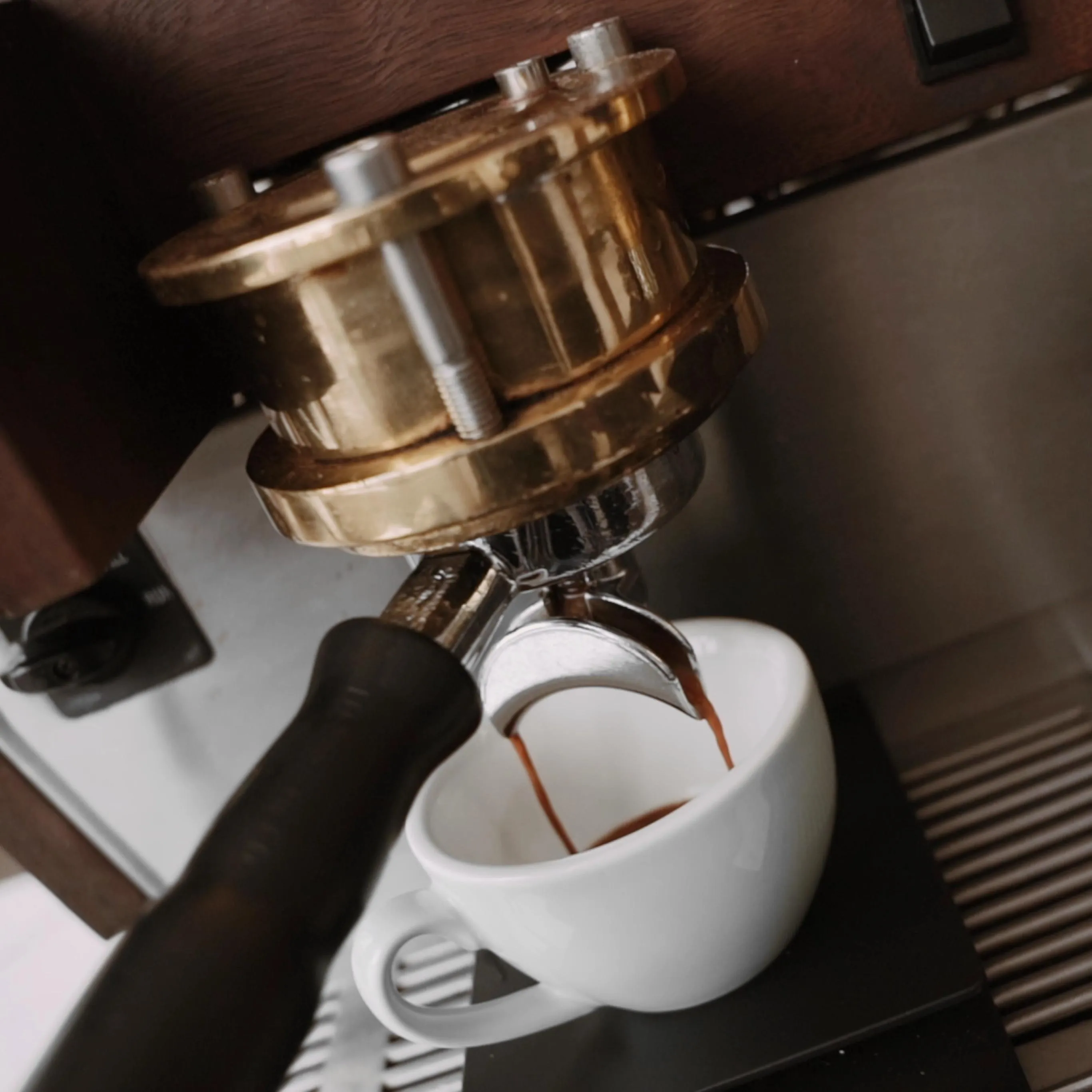
One look and you can almost smell the coffee ☕ We created a landing page crafted for true coffee lovers!
Sector
Personal brand
Client
Around the Coffee
Year
2024
Services


Around the Coffee is a brand from Łódź, founded by Hubert – a coffee enthusiast who shares his passion and knowledge with fellow coffee lovers 💪🏻
The brand specializes in roasting and selling high-quality coffee. Our collaboration focused on building a dedicated landing page for Hubert’s online course – designed to help people master the art of brewing coffee at home.
And since at Kryptonum we can’t imagine a day without our favorite “little black” ☕ (well, some of us go for milk, too), this project was right up our alley!

It all began with strategic workshops, where we immersed ourselves in Hubert’s vision.
For him, coffee isn’t just a daily ritual – it’s an art form. A lifelong journey of learning and discovery.
We talked about the philosophy behind the Around the Coffee brand, its goals, and needs. Our aim? To ensure every part of the landing page reflects Hubert’s passion, professionalism, and dedication.

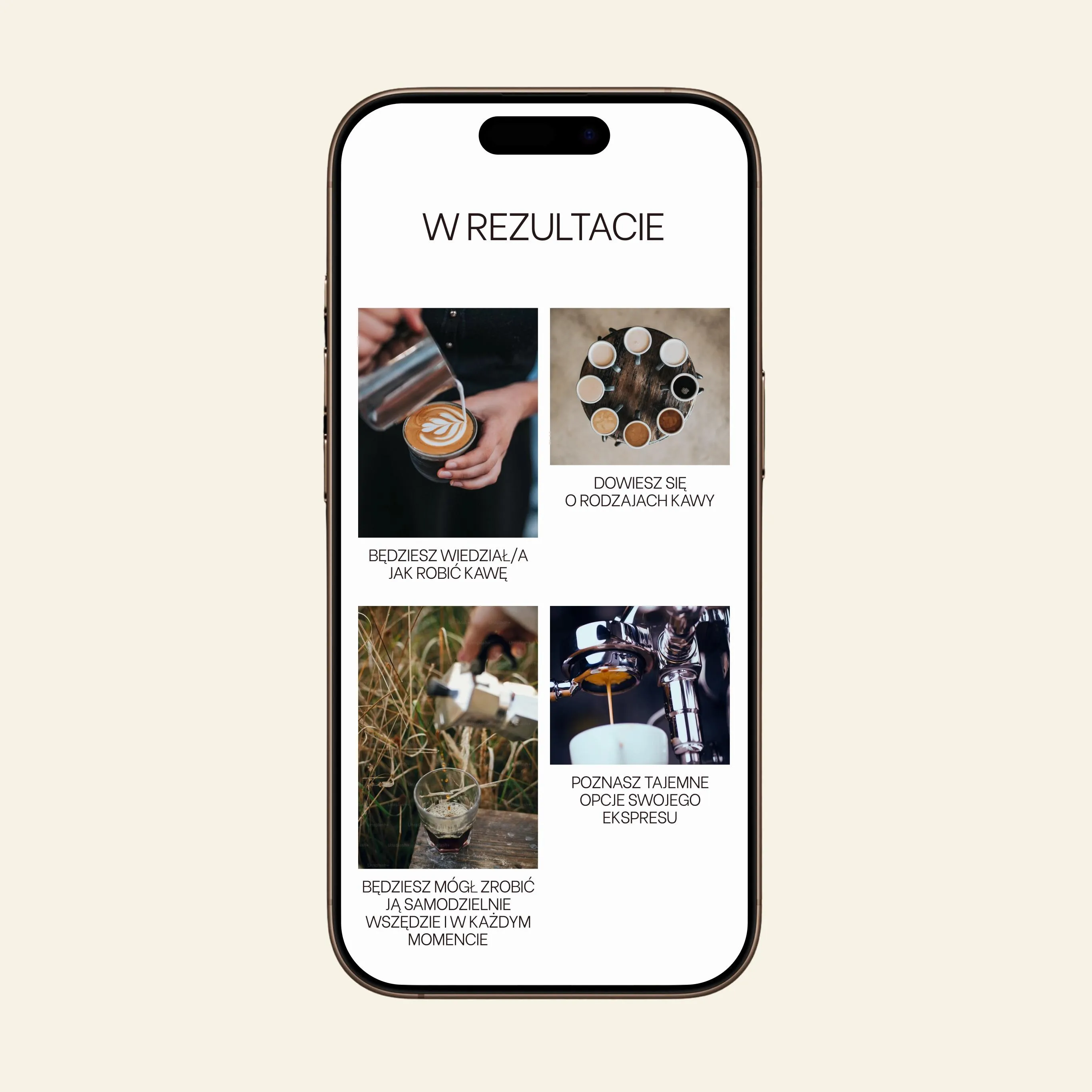
This course is a must for anyone looking to elevate their coffee-making game 🚀
Participants will learn how to choose the best beans, explore different grinding and brewing methods, and unlock the full flavor potential of every cup.
Hubert covered it all – from hands-on tips for taking care of your gear to inspiring lessons that ignite curiosity and creativity in the world of coffee.
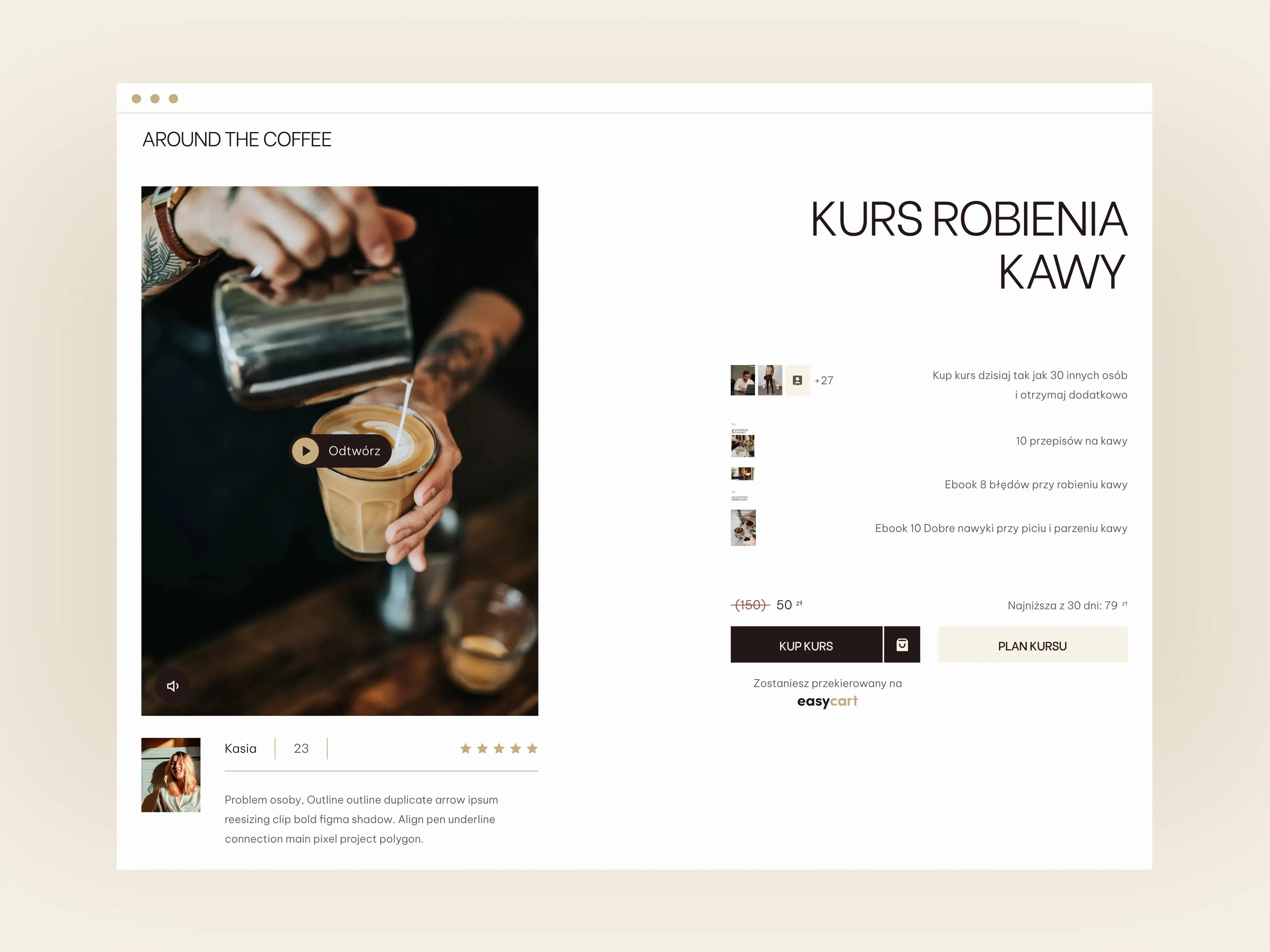
Like measuring the perfect dose of beans 💁🏻♂️, we focused on balancing inspiration with conversion.
The goal was to not only tell the story and stir the senses, but also guide users toward the purchase in a simple, intuitive way.
We went for a minimalist design with a clean layout – making it easy to find key info and decide if the course is a perfect fit.

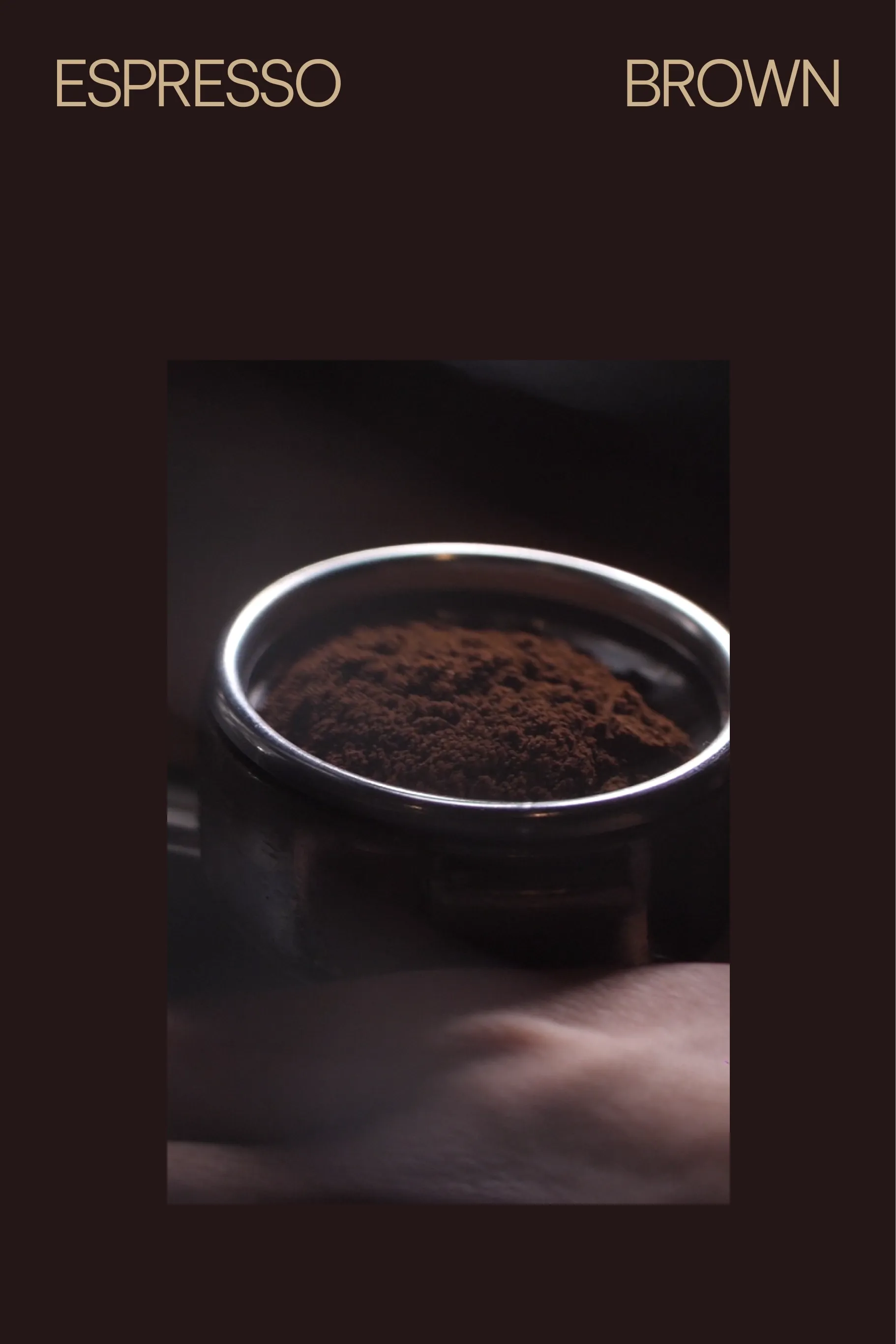
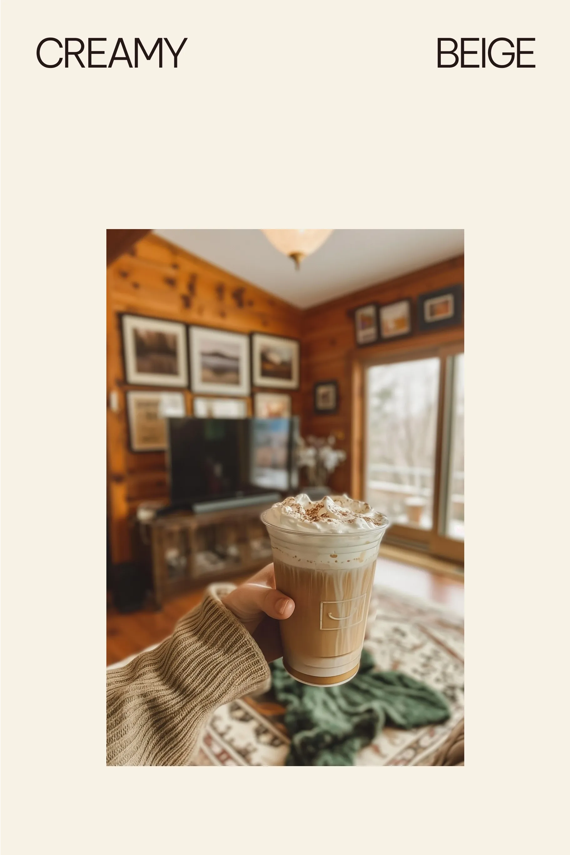
How about a website inspired by the tones of caffè macchiato?
We chose a coffee-inspired palette:
🔸 Espresso brown
🔸 Creamy beige
🔸 Golden toffee
Sounds delicious – looks even better!
These colors perfectly match the brand’s personality, setting the mood and immersing visitors in a world of flavor and aroma 😋

For this project, we selected Be Vietnam Pro – a clean, sans-serif font that’s modern, elegant, and easy to read.
Its minimal design reinforces the brand’s professionalism and ensures the content is pleasant to navigate 👀
Combined with the warm color palette, the typography creates a cohesive visual experience that guides the eye and enhances usability.
Laik Knows